This is the final result

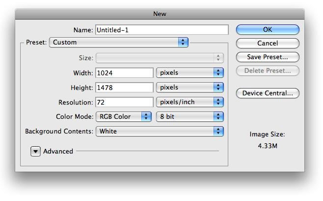
1. The first thing we want to do is to create a new document with the dimensions of 1024×1478 (it can vary to your liking).

2. Next thing we want to do change the overall background color to #1e2329 using your paint bucket tool
3. Now, use your rectangle marquee tool make a selection similar to the following and fill it with #383d43.

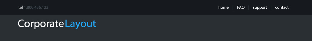
4. Next lets go ahead and add our dummy links in the top right of our header. My link color is #FFFFFF and the dividers are #525961 (see image below for example)
5. I also chose to place some text on the left side providing a telephone number with the same choice of colors as well. For our ‘logo’, the text color for ‘corporate’ is #FFFFFF, and the text color for ‘layout’ is #65b8f9. you should now have something that looks like this

6. The next step is to add a little divider between the two background colors. To do so create a new layer and use your rectangle marquee tool to make a selection 2px high and fill it with #FFFFFF. Make sure it spans across your whole document

7. On this newly created layer, input the following blending options


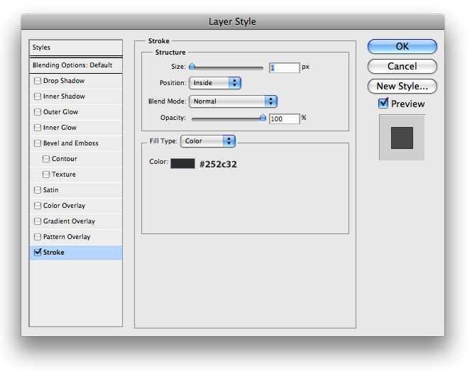
8. Next thing I did was find a stock photo to use in my header. I choose to use one I found at sxc.hu (great free stock photo website), and added a 1px stroke with this color #505255

9. Next lets go ahead and make a search field. For this step I simply used a rectangle marquee tool to make a selection similar to the following and fill it with #FFFFFF

10. I then used the following blending options on its layer

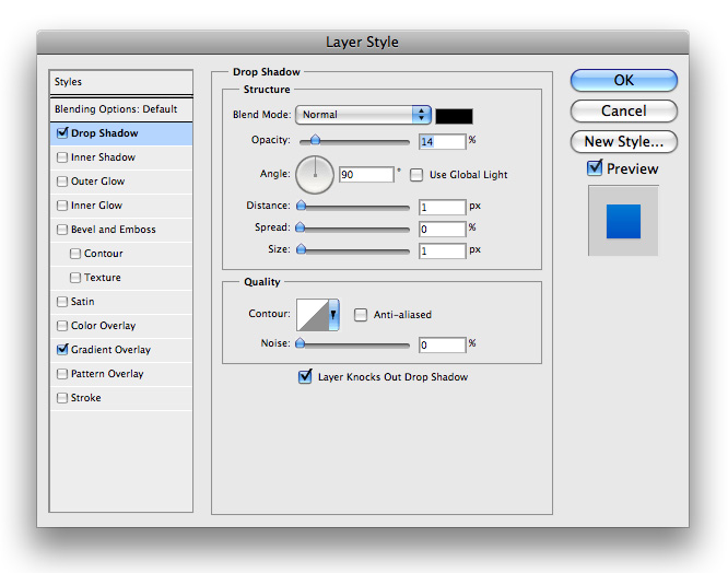
11. The next step we need to take is to create a search button. To do so I used my rectangle marquee tool again and made a selection similar to the following and filled it with #FFFFFF.

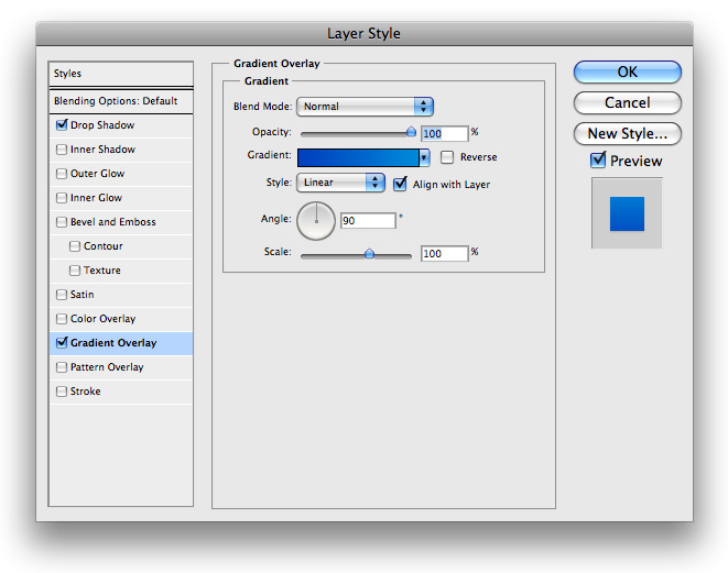
12. I then proceeded to add the following blending options onto its layer. Before you close out of your layer style’s box please read the next step.


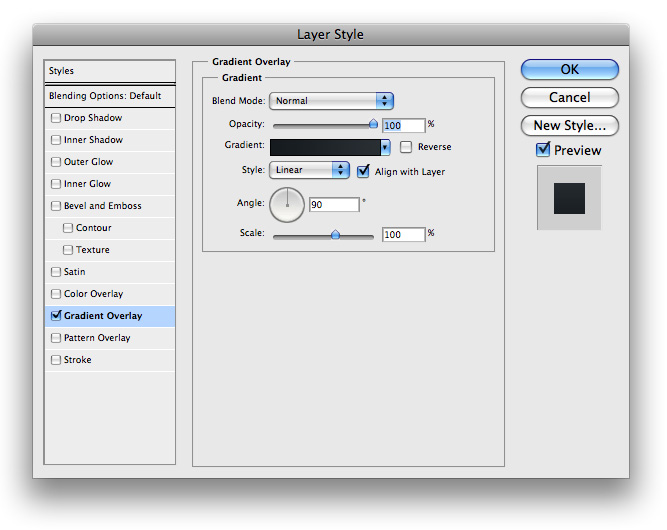
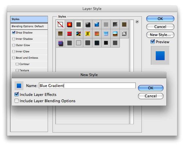
13. Now we will be using this very same gradient and drop shadow on other elements to come in this layout, so we will save ourselves some time by using the ‘Styles’ menu in our blending options. Choose the ‘New Style…’ button from the right side and name your style ‘blue gradient’

14. You will notice that a thumbnail is now added to the list for you to use, and you can go ahead and hit ok to continue.

15. Now just add some white text that says ‘search’ and you can add some text in your input field if you’d like and your document should look something like this

16. The next step is to create a main navigation menu that will go horizontally under our stock photo. To do so, lets go ahead and use our rectangle marquee tool to make a selection similar to the following and fill it with any color (it won’t matter)

17. Next we want to right click that layer and input the following blending options


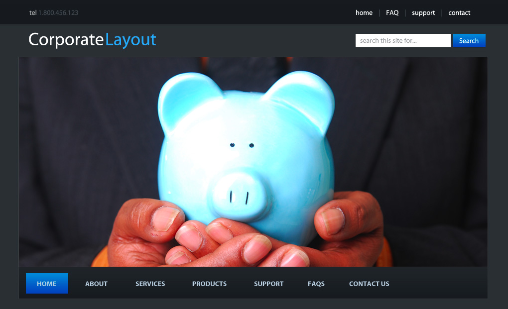
18. Now we want to go ahead and add some links to our menu. Using the text tool make something similar to the following. The font color I used was #CBD9E7

19. To display our active link we want to do something special. Making sure this is under your newly created text layer, using your rectangle marquee tool make a selection similar to the following and fill it with #FFFFFF

20. Now this is where your ‘Blue Gradient’ comes in. Go to your Blending options and then to the styles menu and select it and you should now have something like this

21. Lets go ahead and step back and look at our layout right now to see where we are

22. Looking good I’d say. The next thing we want to do is to add a sidebar. Using your rectangle marquee tool make a selection similar to the following and fill it with #26292E

23. Now using your rectangle marquee tool again (or rectangle tool, which ever you prefer), make a selection similar to the following. It is going to represent what our sidebar headings look like

24. Just use your ‘Blue Gradient’ on that layout and then add some text to name the section and you’ll have something that looks like this

25. Repeat those steps for as many boxes as you want and I came up with this

Yes, I do realize I used the same text under most popular and recent comments (I can be lazy too)
26. For the left side where our posts would be displayed, I have variation backgrounds. For the first post the background color is #2F3338 and for the second it is #2A2D32. Your document will look like this

27. The last step I did was to add some fake content and to add some footer links and this is your final result


1. The first thing we want to do is to create a new document with the dimensions of 1024×1478 (it can vary to your liking).
2. Next thing we want to do change the overall background color to #1e2329 using your paint bucket tool
3. Now, use your rectangle marquee tool make a selection similar to the following and fill it with #383d43.
4. Next lets go ahead and add our dummy links in the top right of our header. My link color is #FFFFFF and the dividers are #525961 (see image below for example)
5. I also chose to place some text on the left side providing a telephone number with the same choice of colors as well. For our ‘logo’, the text color for ‘corporate’ is #FFFFFF, and the text color for ‘layout’ is #65b8f9. you should now have something that looks like this
6. The next step is to add a little divider between the two background colors. To do so create a new layer and use your rectangle marquee tool to make a selection 2px high and fill it with #FFFFFF. Make sure it spans across your whole document
7. On this newly created layer, input the following blending options
8. Next thing I did was find a stock photo to use in my header. I choose to use one I found at sxc.hu (great free stock photo website), and added a 1px stroke with this color #505255
9. Next lets go ahead and make a search field. For this step I simply used a rectangle marquee tool to make a selection similar to the following and fill it with #FFFFFF
10. I then used the following blending options on its layer
11. The next step we need to take is to create a search button. To do so I used my rectangle marquee tool again and made a selection similar to the following and filled it with #FFFFFF.
12. I then proceeded to add the following blending options onto its layer. Before you close out of your layer style’s box please read the next step.
13. Now we will be using this very same gradient and drop shadow on other elements to come in this layout, so we will save ourselves some time by using the ‘Styles’ menu in our blending options. Choose the ‘New Style…’ button from the right side and name your style ‘blue gradient’
14. You will notice that a thumbnail is now added to the list for you to use, and you can go ahead and hit ok to continue.
15. Now just add some white text that says ‘search’ and you can add some text in your input field if you’d like and your document should look something like this
16. The next step is to create a main navigation menu that will go horizontally under our stock photo. To do so, lets go ahead and use our rectangle marquee tool to make a selection similar to the following and fill it with any color (it won’t matter)
17. Next we want to right click that layer and input the following blending options

18. Now we want to go ahead and add some links to our menu. Using the text tool make something similar to the following. The font color I used was #CBD9E7
19. To display our active link we want to do something special. Making sure this is under your newly created text layer, using your rectangle marquee tool make a selection similar to the following and fill it with #FFFFFF
20. Now this is where your ‘Blue Gradient’ comes in. Go to your Blending options and then to the styles menu and select it and you should now have something like this
21. Lets go ahead and step back and look at our layout right now to see where we are
22. Looking good I’d say. The next thing we want to do is to add a sidebar. Using your rectangle marquee tool make a selection similar to the following and fill it with #26292E
23. Now using your rectangle marquee tool again (or rectangle tool, which ever you prefer), make a selection similar to the following. It is going to represent what our sidebar headings look like
24. Just use your ‘Blue Gradient’ on that layout and then add some text to name the section and you’ll have something that looks like this
25. Repeat those steps for as many boxes as you want and I came up with this
Yes, I do realize I used the same text under most popular and recent comments (I can be lazy too)
26. For the left side where our posts would be displayed, I have variation backgrounds. For the first post the background color is #2F3338 and for the second it is #2A2D32. Your document will look like this
27. The last step I did was to add some fake content and to add some footer links and this is your final result
No comments:
Post a Comment